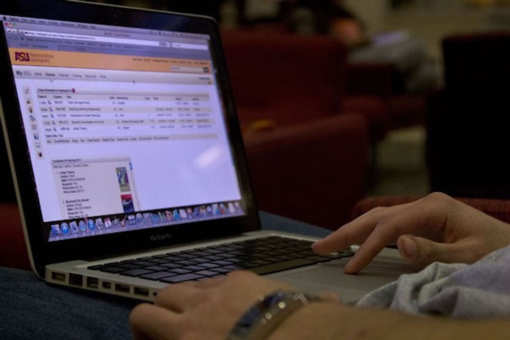
 Business and urban planning senior Adam Daha sits on the first floor of the University Center looking at his ASU account. My ASU underwent a redesign over the course of winter break. (Photo by Ana Ramirez)
Students checking their My ASU page after returning from winter break may have been surprised to see a new streamlined look, now free of pictures.
Jocelyn Rojeck, project coordinator for My ASU, said the original version of My ASU first went online in summer 2008 and the first minor redesign occurred in 2010. This is the page’s second redesign, discounting the minor changes that rolled out continuously.
Rojeck said the changes were launched over winter break to avoid disrupting classes. The launch was also timed to precede freshman orientation in March, so the layout would remain familiar when the freshmen return in the fall.
Rojeck said the changes were made in response to student feedback about My ASU’s cluttered state. Functionality and data were incorporated to provide a richer experience for student and faculty, she said.
Rojeck stressed that there have been no content changes, just a new information layout and added tabs. Faculty can now view account balances of grants, various teaching resources and funding opportunities.
More user customization is available in response to student requests, Rojeck said. Students will eventually be able to choose their own background from ASU-related images, import their google calendars and move the section boxes around.
“If you want announcements up in the corner, you could move it to the left,” she said.
The redesign relied on feedback from students and staff at each point in the six- to eight-month process, said Assistant Vice President of UTO Development Leah Lommel in an email.
“There were about six people working on this in UTO, but we got assistance from staff across campus during this redesign," she said.
The team began by reviewing student feedback, taking everything said into consideration.
Graphic designers then pitched ‘mock-ups,' or webpage ideas, which were further adjusted after students offered feedback. Three full-time developers then coded the final version and sent it to beta-testing prior to launch.
UTO Communications ManagerJason Striker looked at content points and beta-tested the user interface, which took about six weeks.
Striker said the UTO was expecting feedback about the prevalence of white on the redesigned webpage.
“It’s not drab and dreary, just stark compared to the rest of ASU,” he said.
He added that users already have the ability to individualize their My ASU dashboards, though more is expected. Students can collapse section boxes, determining what information is relevant and what can be removed.
Striker said feedback to the new design has been positive.
"Happy students and happy faculty make for happy classrooms," he said.
Film senior Justin Hack said he preferred the old layout.
“I was just used to it and it was easier to navigate,” he said.
Reach the reporter at smande17@asu.edu and follow her on Twitter @SarahDeanderson