What I like — and don’t like — about the 2015 Pac-12 uniform collection.
During rivalry week, The State Press will release a series of content that evaluates Pac-12 baseball as a whole, using various different forms of criteria. Today’s topic? Uniforms.
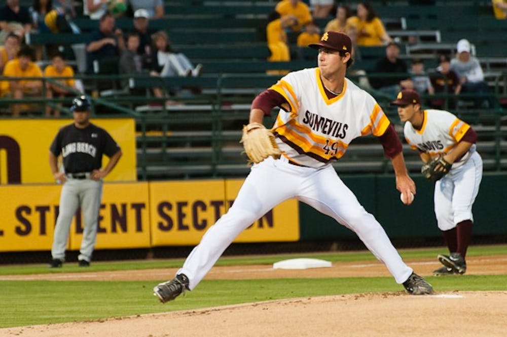
1. ASU’s “Tequila Sunrise”
Gameday focus with #JohnnyBaseball: pic.twitter.com/qAbApNF02J
— Stefan Modrich (@StefanJModrich) April 13, 2015
Is there really a need for an explanation? Even if head coach Tracy Smith isn’t a fan of the '70s era throwback uniforms, they’re a hit with fans and players alike. Maybe they’ll finally appear in the stadium shop at Muni someday.
2. UCLA’s home whites
Congrats to @davidberg_26 & @gjwat12 for being selected as candidates for the @SnrCLASSAward: http://t.co/kkR2pZXWtp pic.twitter.com/sleYZWtoo3
— UCLA Baseball (@UCLABaseball) March 25, 2015
The Bruins have a number of classic duds that could top this list individually, including a powder-blue home whites and a delightful throwback-ish rendition of the home uniform.
3. USC’s black alternates
Congrats to USC freshman Mitch Hart (@MitchHart96) on being named Pac-12 Pitcher of the Week! #FightOn pic.twitter.com/d4RlA6jyCo
— USC Trojans Baseball (@USC_Baseball) March 16, 2015
Contrary to popular opinion, black does NOT go with everything, but it does work with the cardinal and gold with stylized “Trojans” lettering and gold numbers that pop on the front of the jersey. Bonus points to schools (ASU, Cal, UCLA, USC, Stanford, and Washington State) with their own unique baseball logos on their caps.
4. Oregon’s... everything

It would be silly for me to assume a certain Oregon uniform is designated as “home” or “away” because the Ducks have essentially removed those traditional boundaries. They do abide by the white pants at home and gray pants on the road rule, but everything else is essentially in play.
5. Stanford’s home whites
.@Hockeye's three saves already tied for the most by a Stanford freshman since @DrewStoren closed 8 in 2008. pic.twitter.com/59feeAZftz
— Stanford Baseball (@StanfordBSB) March 7, 2015
One of few teams to avoid hopping on the Nike/Adidas corporate train for baseball, this traditional look with a subtle Rawlings logo is a timeless and stylish option, one of just three hanging in the locker room for the Cardinal at Sunken Diamond. Purists, feast your eyes.
6. Oregon State’s orange alternates
News, notes and links for tonight's 7:05 first pitch at UCLA. #gobeavs http://t.co/cAvMKjdzjt pic.twitter.com/nkpey17b7A
— Oregon St. Baseball (@Beaver_Baseball) April 3, 2015
Thankfully, orange is not the new black on baseball diamonds, but the Beavers make it look sharp. The construction cone-esque bright shade of orange will help Oregon State draw fewer comparisons to the Oklahoma State Cowboys, who happen to share the “OSU” acronym and the same color scheme.
7. California’s home whites
Kranson and Paul Homer Wednesday Night at Fresno State Bears next ready to visit Utah #gobears http://t.co/H2iawidvZt pic.twitter.com/JkndM2sC6K
— Cal Baseball (@Cal_Baseball) March 26, 2015
There’s a lot to like about the classic Cal lettering on both the home whites and road grays (and old-school “C” cap) but the navy blue alternate doesn’t provide nearly as much “wow” factor as some other Pac-12 jerseys. It would be neat to draw up something evocative of the history of the Bay Area, or perhaps even work the Golden Bear into a design somehow.
8. Washington’s purple alternates
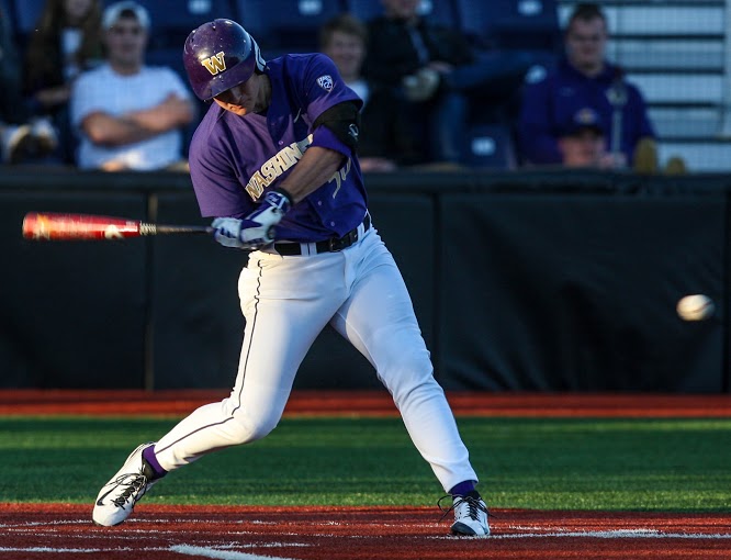
My interests with Washington are similar to Cal’s, because I do like the formal block "W" and the purple is a nice fit with gray road pants. I would really like to see more silver incorporated, maybe even in the form of a Husky on the chest or with the logo in the cap.
9. Washington State’s pinstripe home whites

If it weren’t for all the red in this conference, the Cougars might have found themselves ranked a bit higher. The home whites with red pinstripes should be worn much more often, as should the uber-retro "W" hat. The only problem is its ugly primary logo doesn’t mesh with the throwback look.
10. Arizona’s cherry-red alternates
Arizona’s Austin Schabel (2-2, 5.64 ERA) making his 10th appearance… Limits the damage to four runs in the first. pic.twitter.com/zUTmAs2PPr
— Stefan Modrich (@StefanJModrich) April 13, 2015
The Wildcats could be very creative with all of the patriotic possibilities offered by red, white, and blue as school colors. Instead, they’re left most often donning a bland pinstripe combination that comes across as pretentious and doesn’t offer much contrast from its tri-color main "A" logo.
11. Utah’s black alternates
RT @SaltLakeBeisbol: B8, 0-2 count, bases loaded, and w/ one swing, @tjbennett13 belts a grand slam to right. pic.twitter.com/AoaI4Am3mI
— Utah Baseball (@utahbaseball) April 4, 2014
The lack of variety in Utah’s uniforms and lack of a vibrant secondary color limits some of the possibilities for uniforms, but it allows the black alternates with all-caps and even cursive red stand out. That said, the Utes should expect more out of Under Armour as the company’s flagship representative in the Pac-12.
Reach the reporter at smodrich@asu.edu or follow @StefanJModrich on Twitter.
Like State Press Sports on Facebook and follow @statepressport on Twitter.